Our old bottle was beautiful. Elegant. And a little artsy.
But it wasn’t telling the whole story. A story of tradition and of celebrating with others. A story of many generations of expertise. A story of the land of Jalisco.
It was also unwieldy. Its oblong, weighty shape made Saturday rushes harder on bartenders. Its wide footprint took up a lot of space on home bar shelves. And its wide face made it difficult to package and place on the retail shelves of our favorite small businesses.
So we tapped designer David Cole to help us create a new bottle design – one that met the needs of our connoisseurs, but still communicated the heritage and sophistication of the tequila inside.

“The new bottle design needed to capture El Mayor’s tequila legacy,” said Cole. “Beyond fixing the practical shortcomings of the old bottle, we wanted to take this opportunity to really bring that sense of heritage to life.”
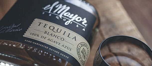
Inspired by craft, warmth and authenticity, Cole created a more traditional silhouette that spoke to the Gonzalez family’s four generations of tequila-making.
With muted earth tones and agave ink illustrations, the new label pays homage to the history of the land, as well.
“The rounded shoulder, oval footprint and tapered base all suggest elegance, without abandoning tradition and craft,” said Cole. “And the wide, jug-like proportions suggest tradition and craft without making use difficult for our bartenders.”

Indeed, the smaller base and new solid wooden bartop cork make pouring and storing easier on home and professional bartenders alike. Coupled with the throwback design elements, our new bottle makes for a gracious guest on any bar.
“It’s a remarkable marriage of craft and tradition from the design side,” Cole said. “But what really makes it sing is the quality of the engineering. We’ve given bartenders what they need to make building El Mayor Tequila recipes easier on their wrists and on their bar space.”

